Aug 20, 2025
7 MIN READ
Making Your Website Feel Human
How to use emotional design principles to create websites that connect deeply with your audience.
UX DESIGN
PSYCHOLOGY

Modern websites are fast, clean, and usable. But most of them still feel cold. Functional, yes. Memorable, no.
This is where emotional web design comes in. It is the practice of designing digital experiences that connect with people on a deeper level. Not just with logic, but with feeling.
In a world filled with choices, people remember how your website made them feel. So if you want your brand to stand out, it is time to stop designing like a robot and start designing like a human.
What Is Emotional Web Design?
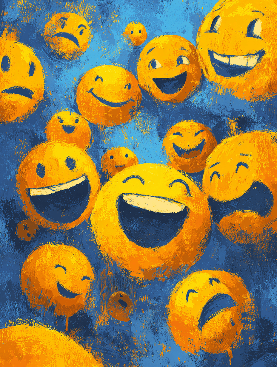
Emotional web design is the intentional use of visuals, language, interactions, and micro-moments to spark emotion. It is not about making things overly sentimental. It is about recognizing that users are people. People with hopes, frustrations, dreams, and doubts.
Great emotional design:
Builds trust
Sparks joy
Creates empathy
Encourages action
It turns websites into experiences. And experiences into relationships.
Why Emotion Matters in Digital Products
Most decisions are emotional first, rational second. People buy, subscribe, and stay based on how something makes them feel.
Emotion improves retention
Users return to products that make them feel understood.
Emotion drives sharing
People share what surprises, delights, or moves them.
Emotion creates loyalty
Brands that connect emotionally do not need gimmicks. People stick around because they care.
How to Make a Website Feel More Human
Let’s break it down with practical techniques any founder, designer, or developer can use.
1. Use Human-Friendly Language
Talk like a person, not a policy manual. Avoid corporate jargon. Cut robotic error messages.
Instead of:
“Your session has timed out due to inactivity”
Try:
“Looks like we lost you for a moment. Want to pick up where you left off?”
Every word on your site is a chance to connect.
2. Show Real Faces and Stories
Humans relate to humans. Use real photos of your team, customers, or community. Even illustrations should feel expressive, not generic.
Tell user stories that highlight emotion:
A freelancer who found peace of mind with your app
A startup team that felt more focused using your product
These stories should go beyond outcomes. Show the journey.
3. Add Delightful Microinteractions
Little moments matter. They show that you care about the details.
Ideas:
A subtle animation when adding an item to cart
A thoughtful message after completing a task
A progress bar with encouraging language
These microinteractions are often invisible until they are missing.
4. Use Emotionally Intelligent Color and Typography
Design is not just decoration. Color and typography shape emotion instantly.
Use:
Softer color palettes to create calm
Bold color pops to express confidence
Rounded typography for approachability
Serif type for trust and authority
Match your design to your brand’s emotional goals.
5. Design for Moments, Not Just Screens
Think about how users feel during key points:
First visit
Signup success
Error messages
Downtime
Each of these moments has an emotional weight. Handle them with care.
For example: A 404 page can either frustrate or charm. Use humor or helpful direction instead of leaving users lost.
6. Respect the User’s Time and Attention
Few things are more human than empathy. Do not waste people’s time.
Keep forms short
Reduce unnecessary clicks
Load content fast
Provide clear next steps
Respect builds trust. Trust is emotional.
7. Make Empty States Helpful and Encouraging
Empty states are often overlooked. But they are prime emotional space.
Instead of showing a blank dashboard, explain what to do next. Add a warm message or a playful image.
Example: “Your dashboard is a little quiet. Add your first project to get started.”
This turns confusion into clarity.
8. Inject Personality Through Voice and Visuals
Every touchpoint should feel like it is coming from the same person.
Is your brand warm and funny? Let that shine in buttons, headers, tooltips.
Is your brand calm and reliable? Reflect that in colors, spacing, and phrasing.
Think of your site like a conversation. How do you want users to feel after it?
9. Design for Emotional Range
Emotion is not just about joy. Users can feel frustrated, confused, excited, nervous.
Plan for those feelings:
During bugs, offer empathy and clarity
During wins, offer celebration
During waiting, offer reassurance
The more emotional range you handle well, the more human your product feels.
Examples of Emotional Web Design Done Right
Mailchimp
Playful illustrations, friendly copy, and even a high-five animation after sending a campaign. It makes email feel less boring.
Headspace
Soft colors, rounded type, and a calm voice make the app feel like a safe space.
Notion
Minimal but warm. Even error messages feel intentional. The onboarding flow guides users without pressure.
Stripe
Crisp, confident, and trustworthy. Not flashy, but every visual element communicates strength and stability.
Final Thoughts
We design for humans. Yet most websites still feel like machines.
Emotional web design is not about adding fluff. It is about caring more. About the people who visit, what they feel, and what they remember.
So slow down. Speak clearly. Sweat the small stuff.
Because the websites people love are the ones that feel alive. The ones that feel like someone’s home, not just someone’s homepage.